

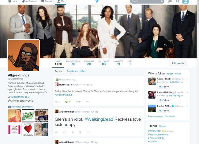
Twitter has made major changes to user profile pages and I have to say the update makes the social media platform look a lot like Google+ and Facebook pages but I like it.
The new layout design is wider and utilises the space a bit better. The bio has moved to the left hand side and the trends and who to follow has moved to the right on the profile landing page.
Below the header image are tabs for Tweets, Photos/Videos/, Followers, Following, Favourites and Lists.
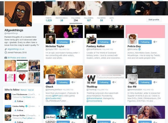
My favourite feature is the Photos/Videos/, Followers, Following tabs, probably because it has a Pinterest feel about it and I love me some Pinterest.
The tweets tab is split into your tweets or your tweets with replies, quite useful if you want to follow a conversation. Your tweets that have been retweeted or favourited the most will appear bigger than the rest so you can view your awesomeness at a glance.
Another feature you might find cool is the ability to pin a tweet to your profile page. How’s that useful? Well say you said something profound that one time and wanted new followers to be aware of your depth, you could pin that profound tweet so it’s the first one people see. How do you do that you ask? Just find your fave tweet, click on the more tab and pin away.
My only gripe is the size of the header image has changed meaning; I actually have to do some work as the picture looks fuzzy and stretched. Oh well it was probably due a spring clean anyway and with the recommended image dimensions increasing to 1500x500px, I can get real creative if I choose to. I think I should choose to.
Twitter have been user testing this new look since February so I’m assuming that if I have the new look then everybody has it, if you don’t it won’t be long now.
Wow this new profile on twitter is looking stunning. Seems like they are also changing the design and on the path where Facebook was. Keeping yourself update with time help you survive.
When this is going to be effect on all twitter profile ? ? ?